Artistic movements and styles often bleed into the living spaces of architecture and interior design. Specifically, “the Renaissance in the 17th century, Baroque in the 18th century, and Art Nouveau, Art Déco, and Bauhaus in the early 20th century, have significantly impacted architecture. Architects drew inspiration from the ideals, concepts, stylistic approaches, and techniques of these movements, using them to create large-scale habitable structures” (Archdaily.com).
In this blog series, we’ll look at some of these movements and how they influenced home and design. Let’s start with one of the more recent movements in our historical memory: Bauhaus (1919-1933).
ORIGIN
Bauhaus is an artistic movement that emerged in the early 20th century that connected creativity and expression with the mass industrial production of the time. Its ideas originated from an actual school of art called Bauhaus, which translates into “Building House,” founded in 1919 by Walter Gropius in Germany.
The Bauhaus movement emphasized functionality, simplicity, and the unity of art and industrial design. It encouraged the idea that design should service people, merging aesthetics with everyday utility. Therefore, the key concepts of Bauhaus designs are minimalist, favoring clean lines and functional forms.
Although mass production influenced this movement, “Bauhaus designs weren’t about cutting corners to make items as cheap as possible, but rather about figuring out how to thoughtfully, beautifully create simple objects with the new tools and materials at hand” (architecturaldigest.com).
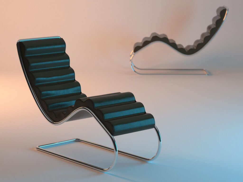
For instance, Bauhaus interior design focuses on open floor plans and the showcasing of steel, glass, and concrete. This allows flowing space to promote utility and simplicity. The basic elements and structure of a building are not hidden away. Furthermore, Bauhaus introduced tubular steel furniture and pieces that emphasized geometric forms that are still iconic today, such as the Wassily chair by Marcel Breuer.
Some other classic Bauhaus furniture examples include Josef Alber’s nesting tables and Ludwig Mies van der Rohe’s Barcelona chair.
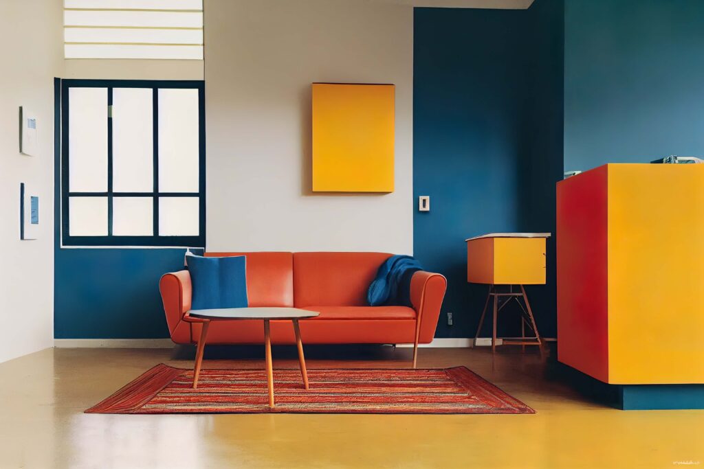
While the Bauhaus is often associated with monochromatic schemes, it also embraced primary colors, which were used thoughtfully to enhance design without overwhelming it.
INSPIRATION
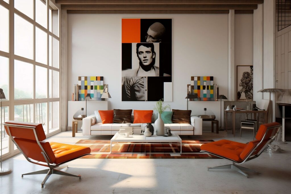
This first example of Bauhaus in interior design showcases the industrial elements of this open space living room: the ceiling beams and vertical wiring running down the wall. White as a minimalist color helps emphasize the boldness of the orange accents.
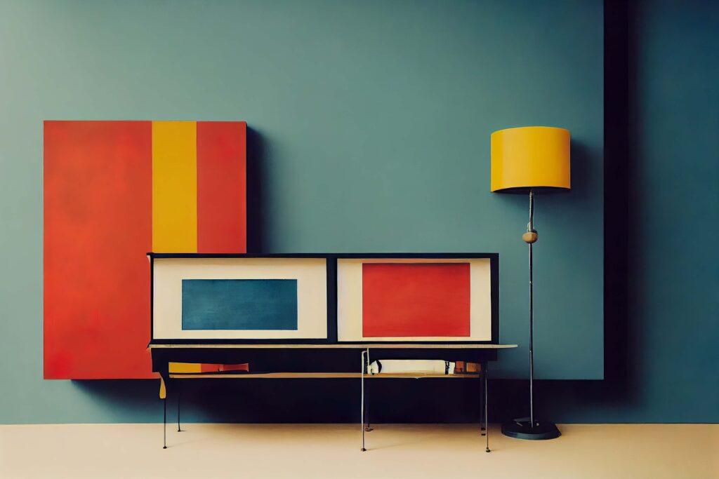
In the second example below, the simple cabinet plays into the geometric emphasis of Bauhaus, with the rectangular primary colors on the furniture being contrasted with the vertical yellow stripe in the painting.
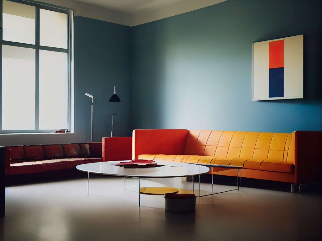
This living room below has a similar effect, with a very minimal geometric painting hung on the wall. The primary color blue for the walls helps tie the space together in a simple yet artistic and interesting way.
Primary colors are also utilized in the space below. Although colorful, it still seems understated without too organic shapes distracting the eye. Everything has clean lines.
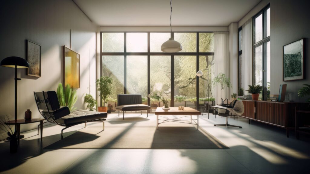
This example is more monochromatic and features less of the primary colors. However, this sitting room design still has the essence of Bauhaus. The furniture emphasizes a geometric form while the open window with steel framing permits light to flood into the open floor plan.
COMPLEMENTARY PRODUCTS
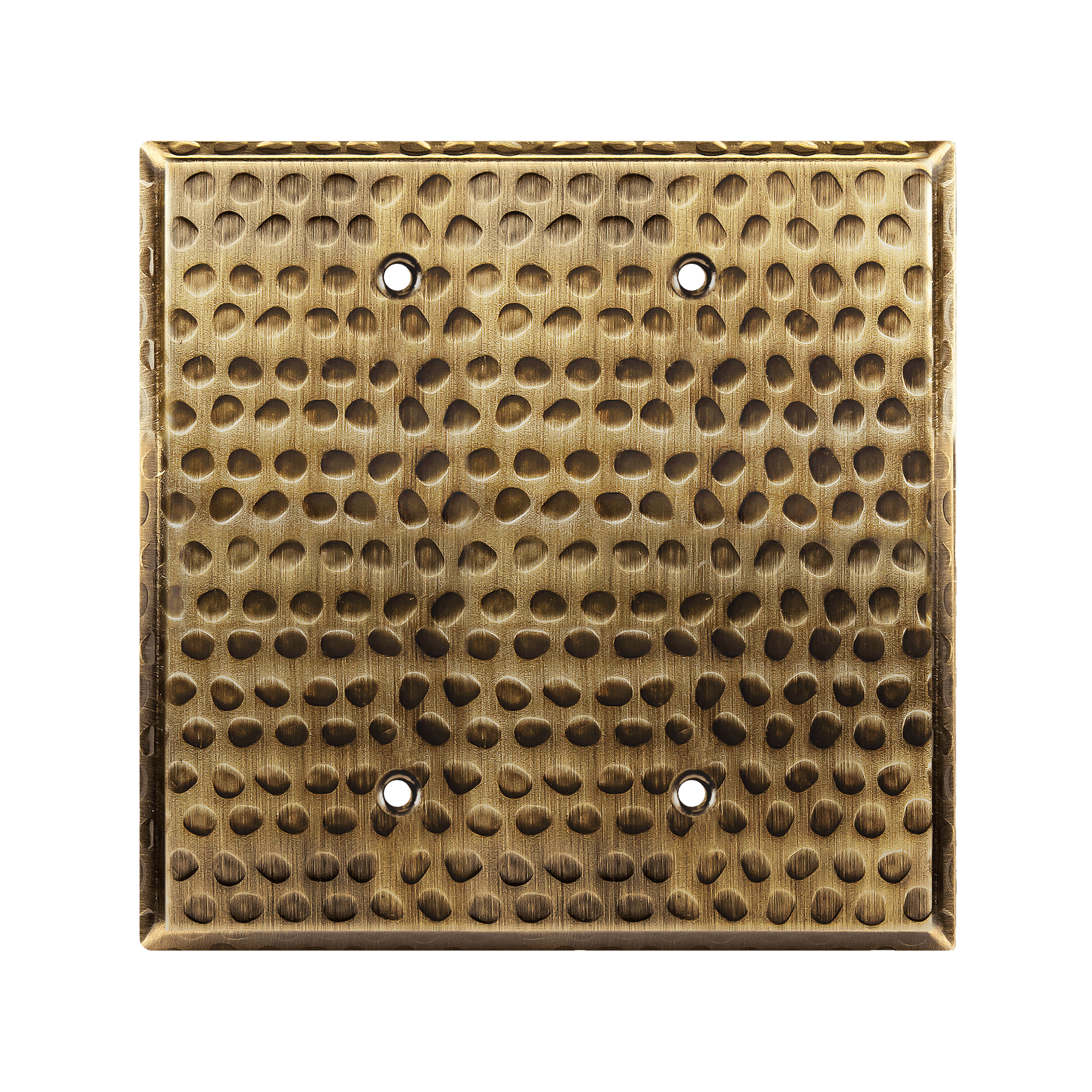
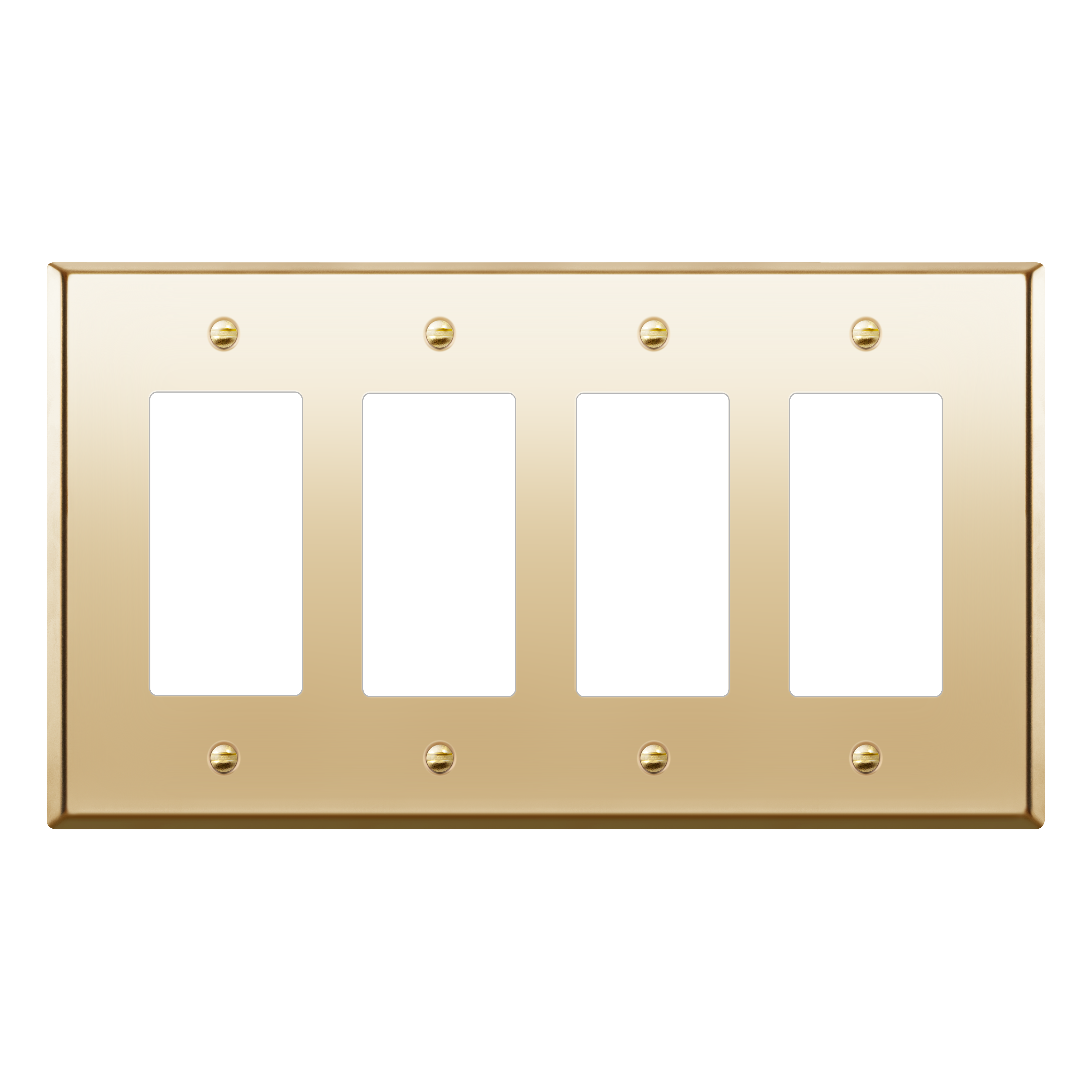
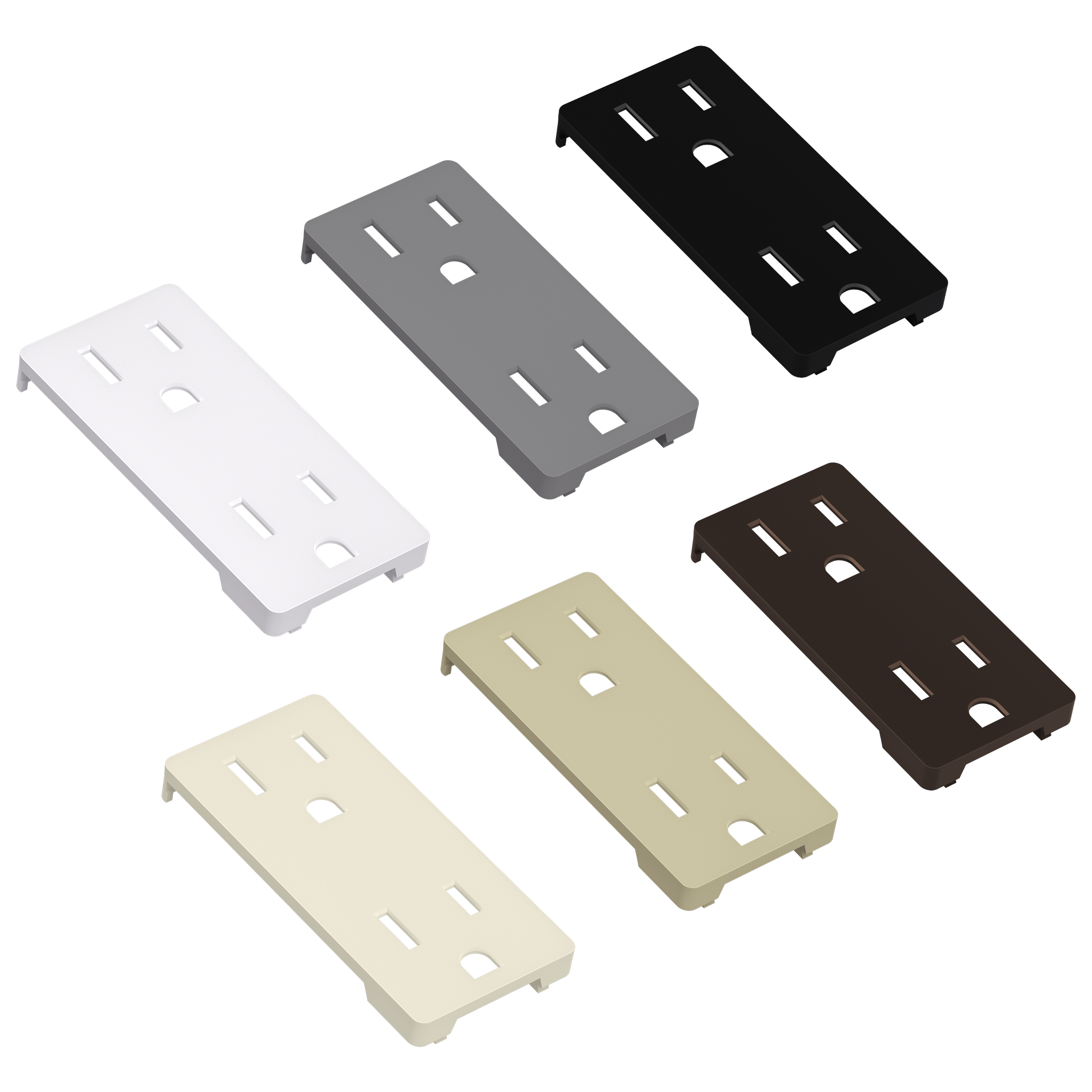
When incorporating the artistic elements of Bauhaus into your design, complementing that with the right furniture and decor that matches your space is just as important. A great way to tie the space together is to feature Lider’s expansive catalog of wall plates and outlets. This small detail can make a huge difference to your overall space.
Happy designing!

