
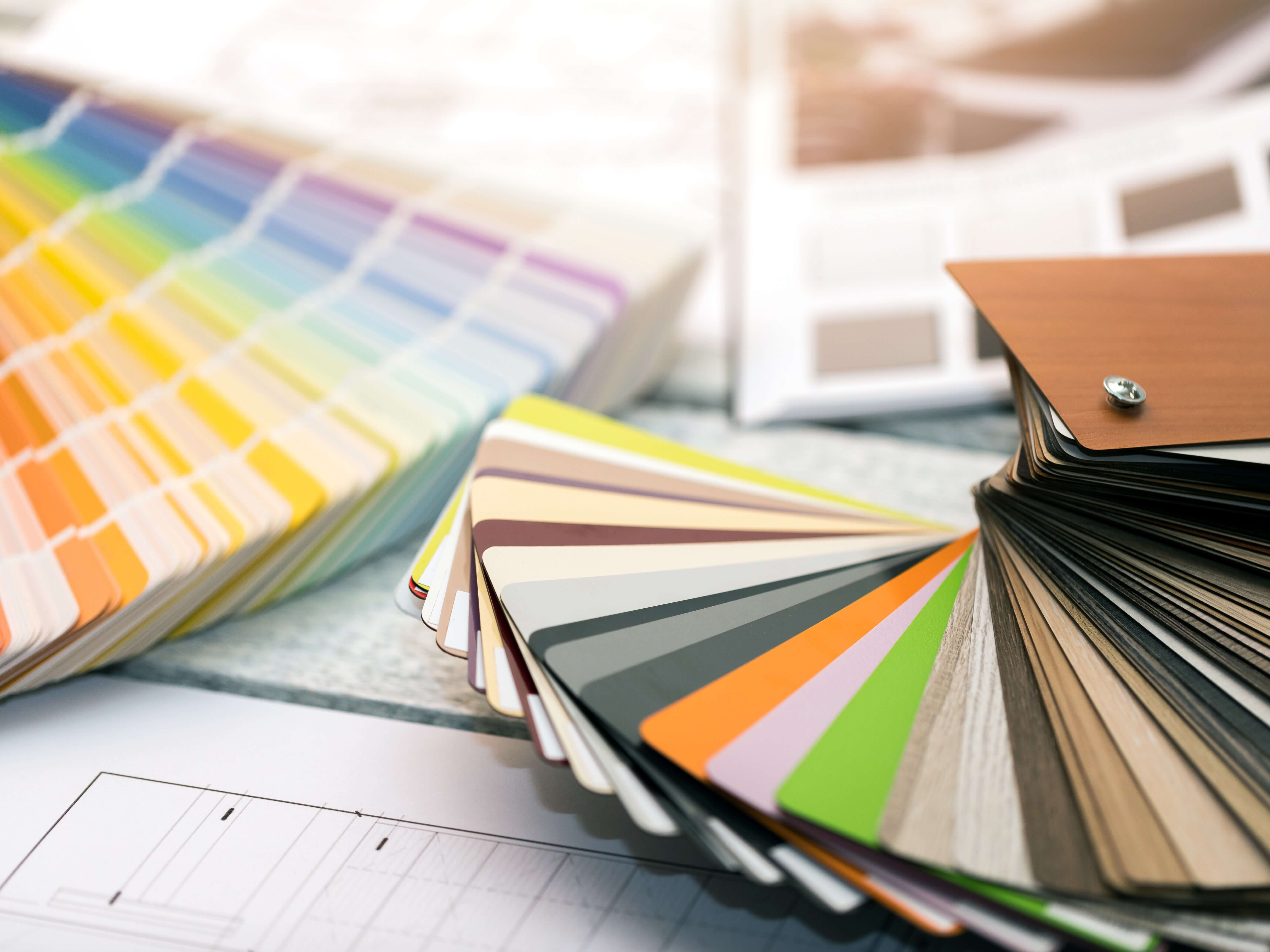
An easy way to take your interior design to new heights is to ensure that the area has a harmonious color palette. Understanding the power of color theory is essential to all designers. It creates a cohesive look and matching color scheme that is pleasing to look at. Even when using many bold, bright colors, there is a way to make it work without making it seem busy or random.
In this quick guide, we’ll explore the fundamentals of color theory and harmonious interior design colors, and showcase inspiring examples from various design disciplines.
60-30-10 RULE
In general, interior design tends to follow what is known as the “60-30-10 rule.” This number essentially sets the ratio of colors in the room. If you are a beginner and don’t fully understand color theory, this might be the way to go for you.
The 60-30-10 design rule is a widely recognized principle used to create a balanced and visually appealing color scheme. This rule suggests allocating 60% of a design to a dominant color, 30% to a secondary color, and 10% to an accent color. By adhering to this guideline, designers can achieve a harmonious composition with a sense of hierarchy and cohesion.
As per the 60-30-10 rule, it is recommended that there should be one, primary color in the room as the backdrop. It should take up 60% of the color in the room.
It is common to find these dominant colors to be subdued or neutral, a basic color. The dominant color sets the overall tone and establishes a visual foundation. This dominant color is commonly the paint color.
The secondary color should complement or enhance the main color. It can be demonstrated in 30% of the room.
The tertiary color is usually an accent, such as the gold lamps in the photo below, which should take up 10% of the design. It adds pops of contrast and visual interest, drawing attention to specific elements or focal points. It is a great balancing color.
The 60-30-10 rule offers a flexible framework that allows for creativity while ensuring a well-balanced and visually pleasing outcome in various design projects.
COLOR THEORY
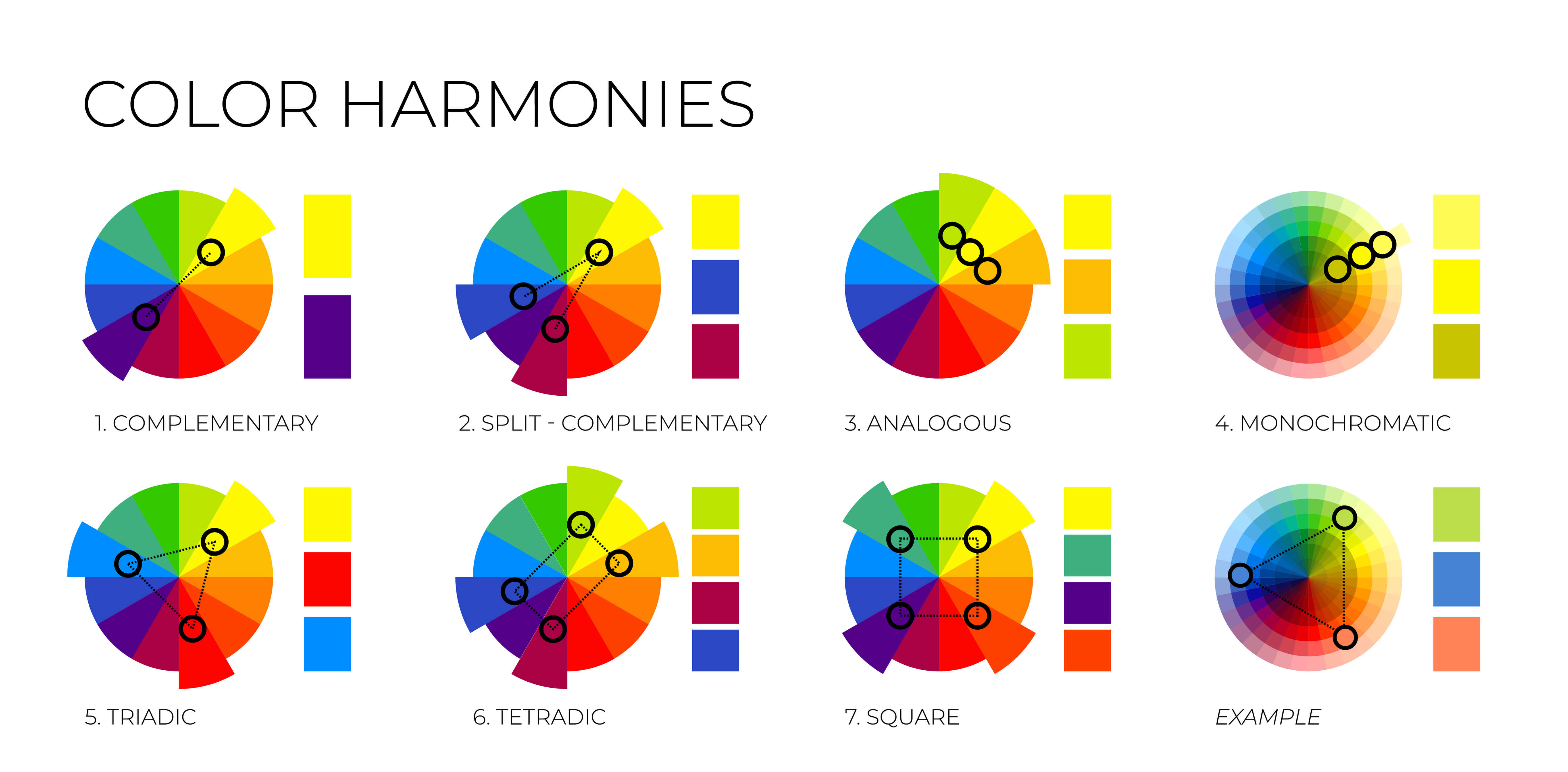
Color theory is a field of study that explores how colors interact, combine, and affect human perception. It explores which color combinations we see as matching and what doesn’t work. It is based on the color wheel, a visual representation of the spectrum of colors arranged in a circular format. The color wheel helps to understand the relationships between colors and provides a foundation for creating harmonious color schemes.
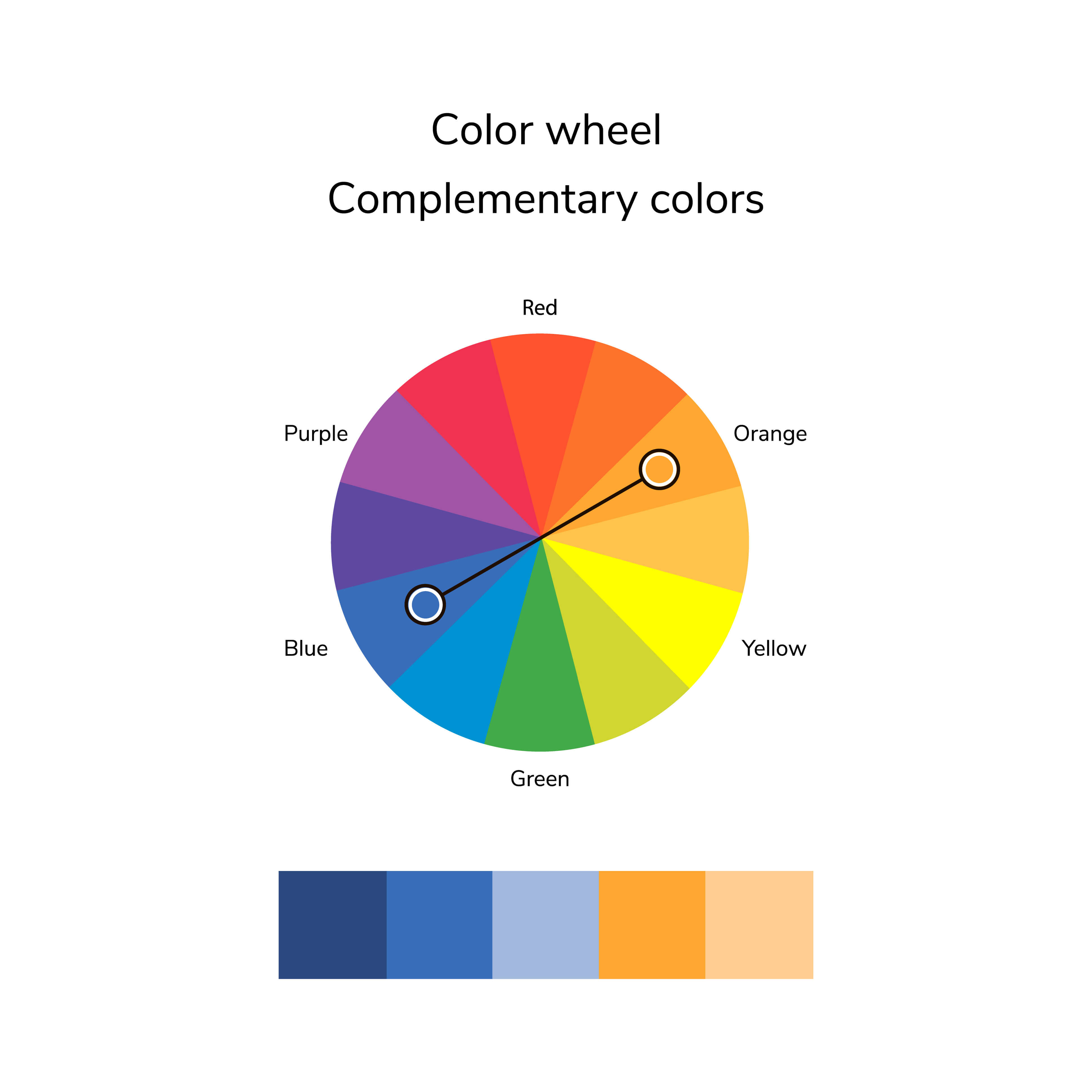
When looking at the color wheel, you can find complementary colors by seeing which colors lay diagonally across from each other. For instance, blue and orange are complementary, as well as red and green.
Analogous colors are next to each other on the color wheel. They share similar undertones and have a natural harmony when used together. For instance, yellow, red, orange, and green.
Monochromatic colors refer to a color scheme that involves using different shades, tints, and tones of a single color while maintaining the same base hue.
EXAMPLES
Monochromatic color scheme:
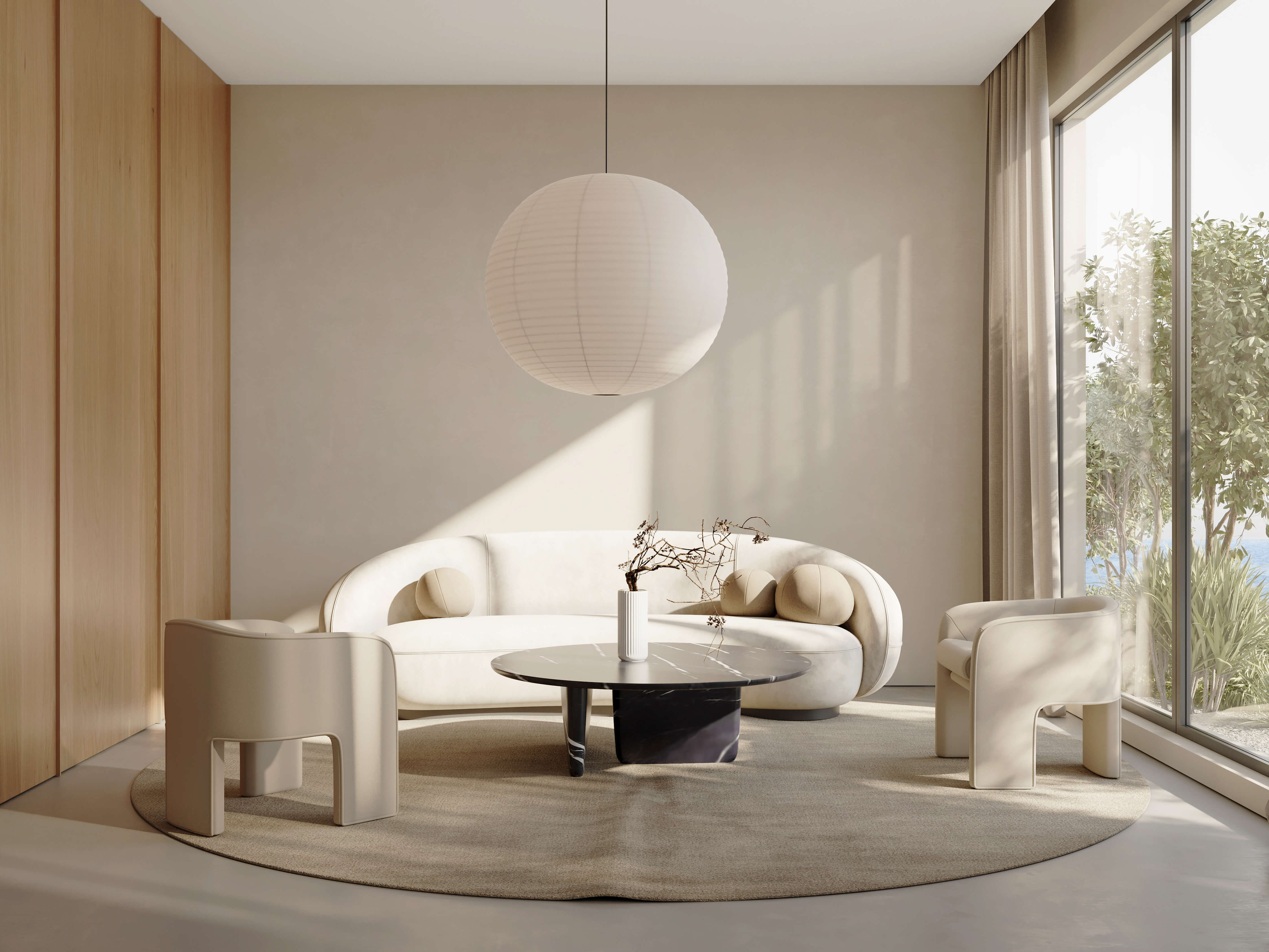
This monochromatic scheme features the neutral color white. There are darker shades of white on the beige rug. The light wood wall adds to this neutral color scheme. It also adds texture that contrasts the white wall.
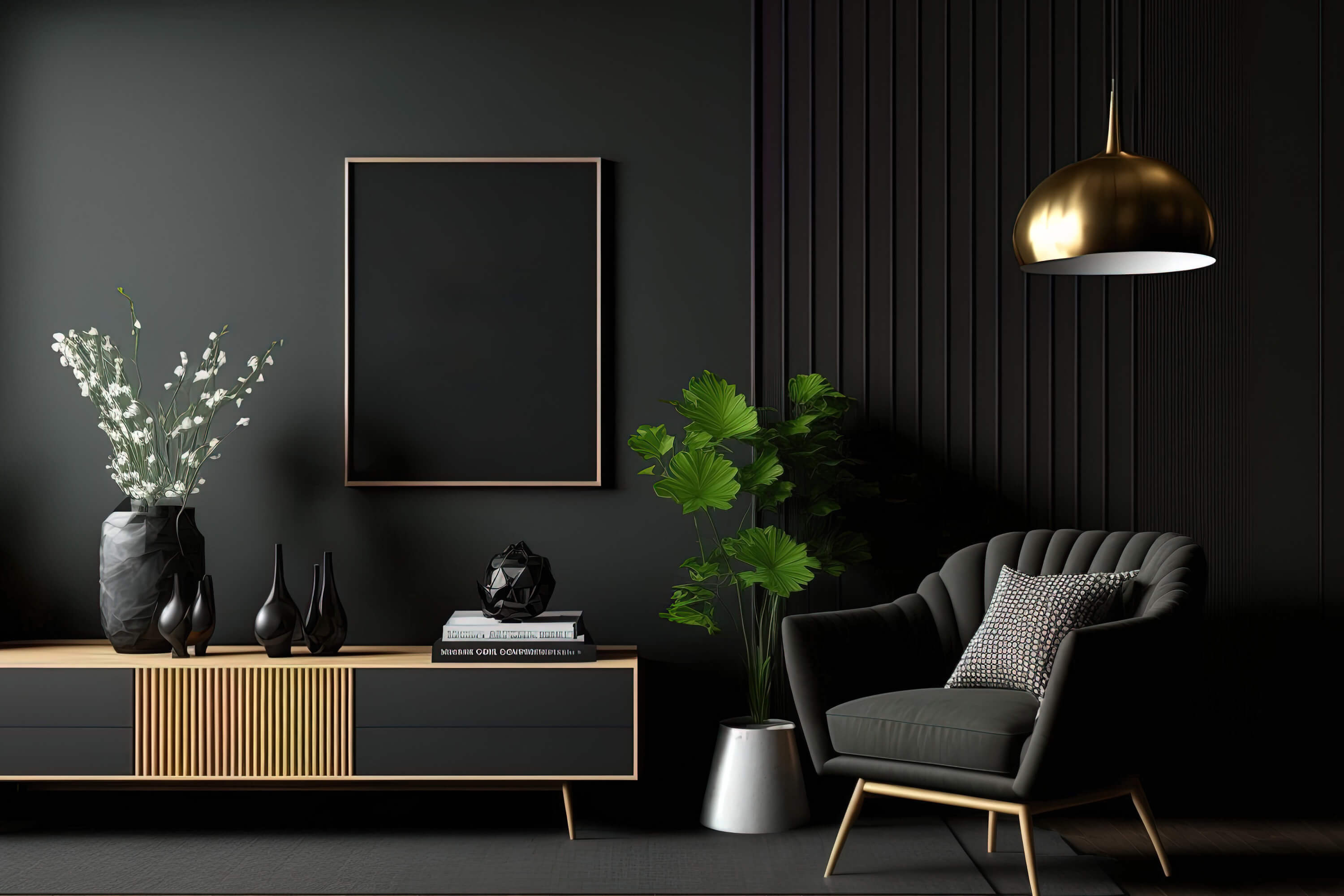
This black monochromatic design appears to be sleek and elegant. It is accented by light wood and gold in a hanging lamp.
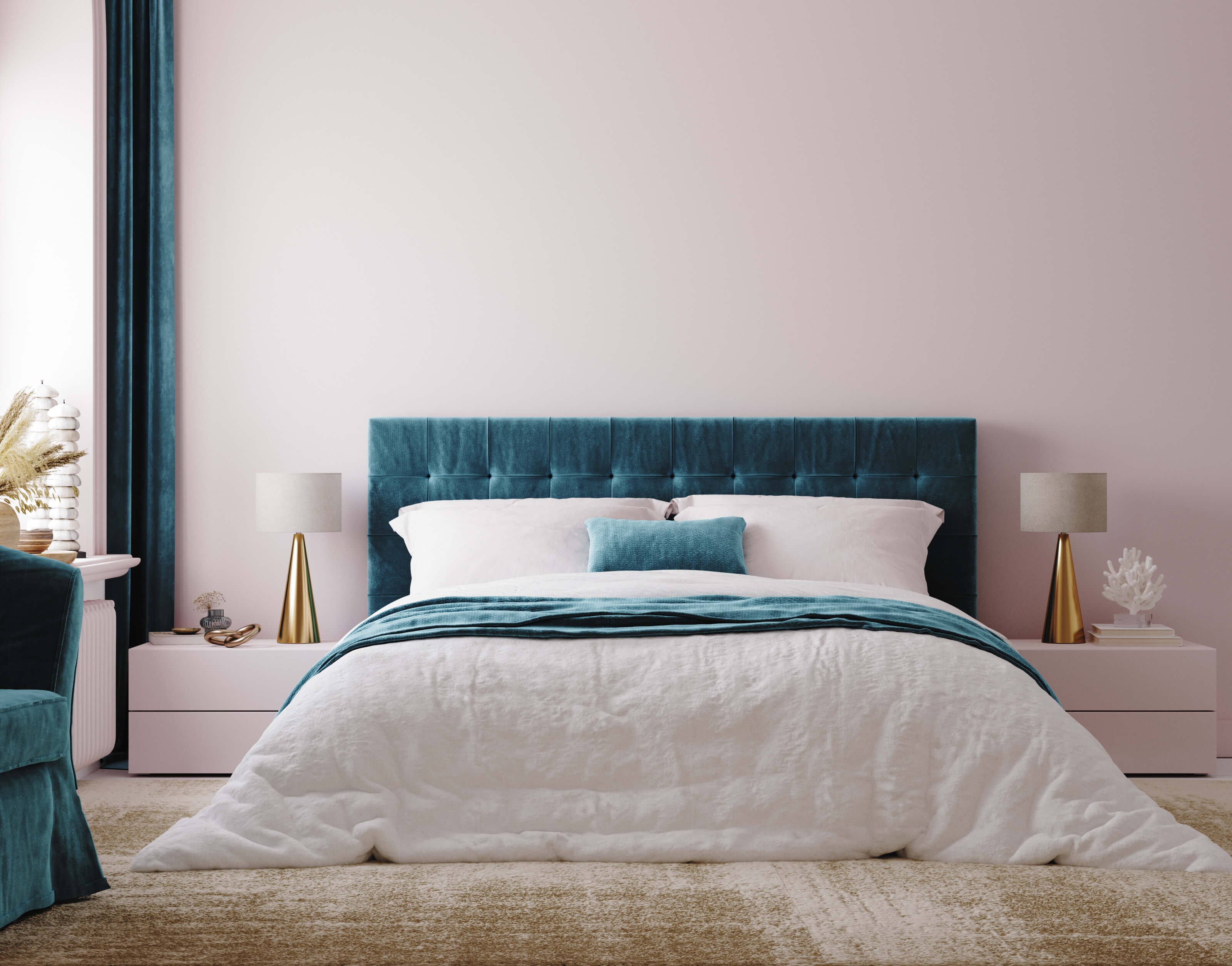
Complementary colors:
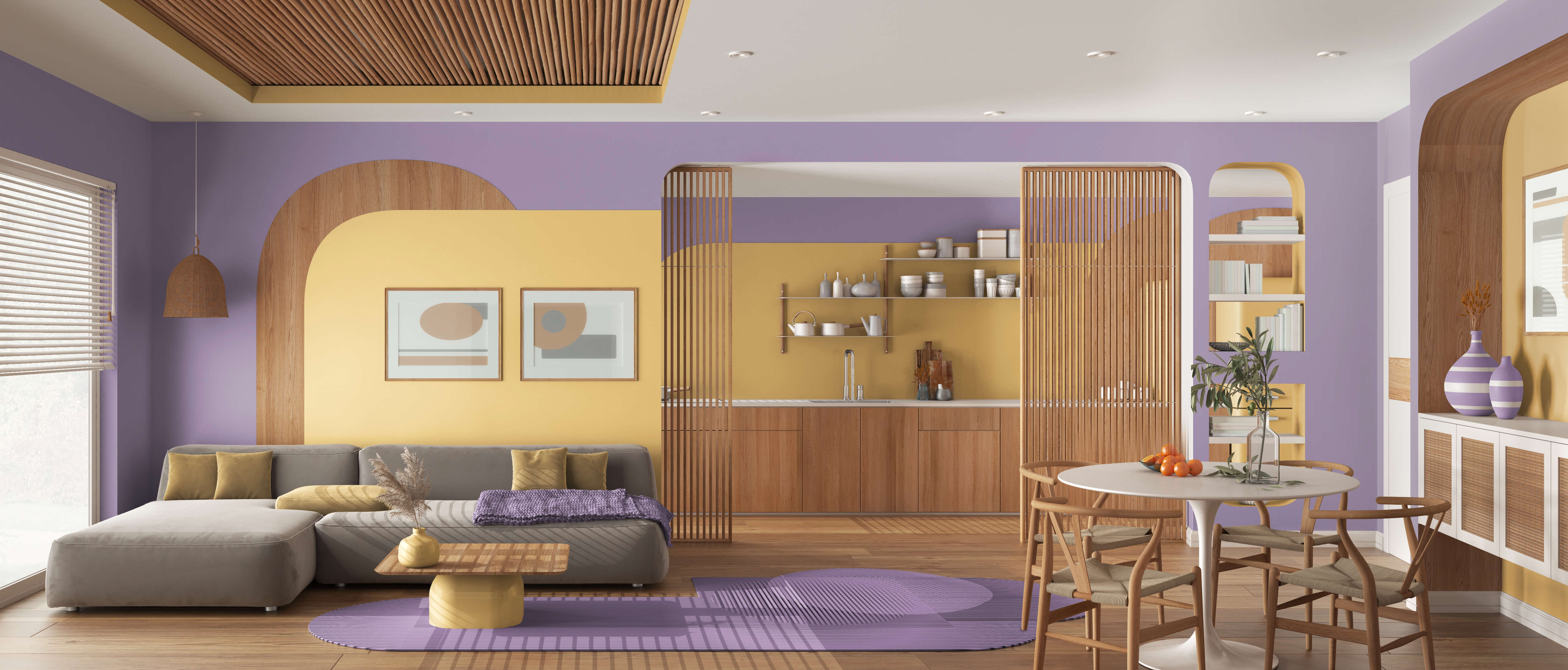
Purple and yellow are complementary colors, as exhibited by the color wheels above. This lighter tone of the colors offers an airy, summery look which is enhanced by the light wood.
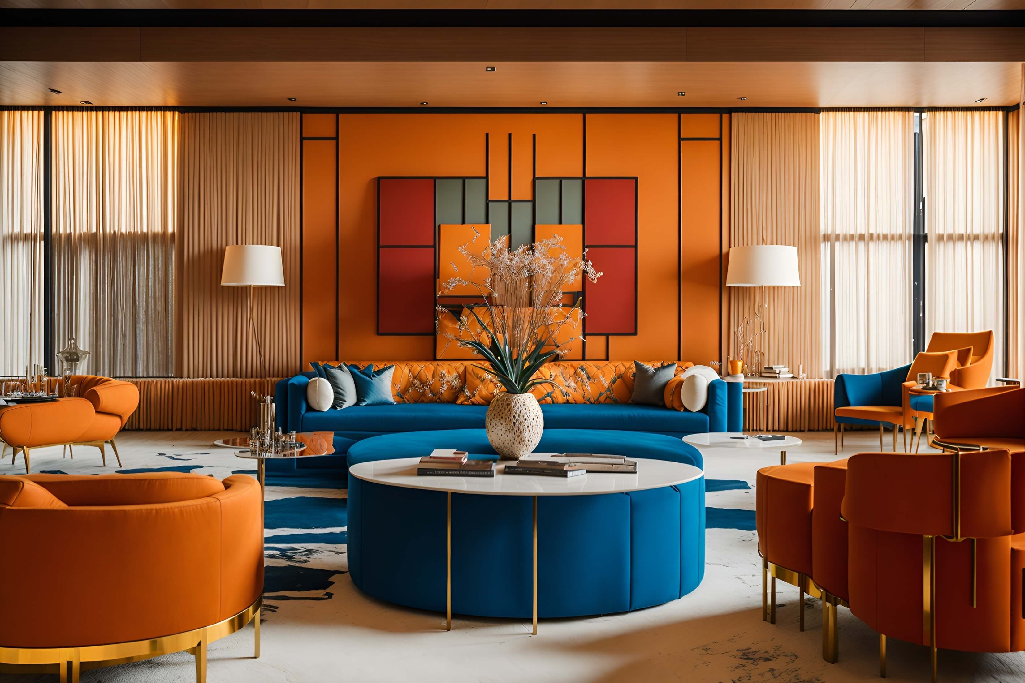
Blue and orange are complementary colors that are rich and bold. It is used throughout this design, with blue being slightly less utilized than orange. This maintains a fun, retro vibe.
Analogous color scheme:
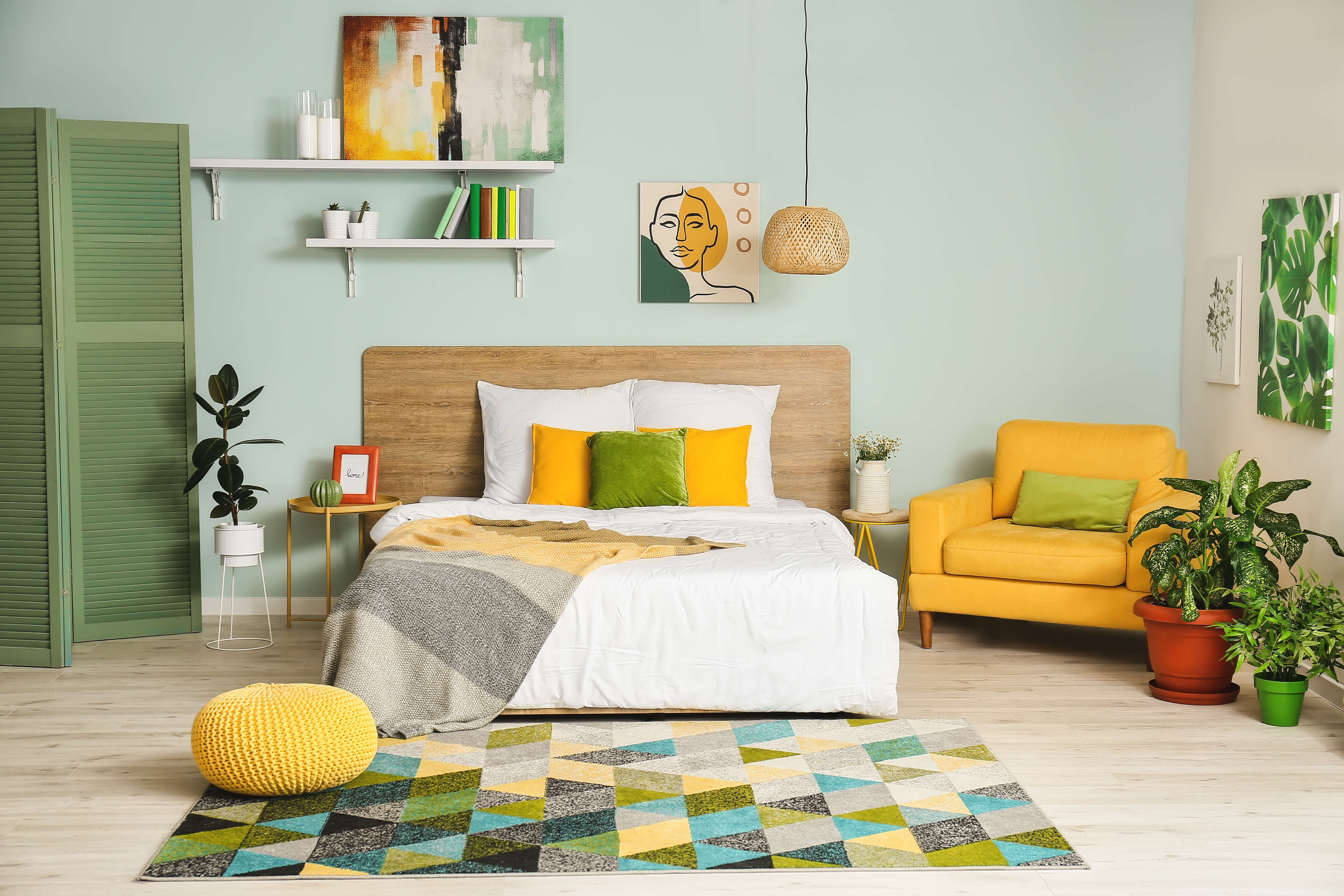
This bedroom utilizes yellow, green, and blue which are next to each other on the color wheel. There is a natural, cohesive, and refreshing summer look to this room.
COMPLEMENTARY PRODUCTS
Lider is motivated to aid in your creative design process where we can. When considering accents to your interior design, our expanding catalog of products will be a perfect addition to the final touches of your room. For instance, when regarding the “10” of the 60-30-10 rule, add gold accents with these wall plates.
Shop more on our website or visit our Amazon storefront.